Code & Projects · December 13, 2016 · Rachael
Visualizing Cambridge Bicycle Accident Data
In October, a Lexington cyclist was killed by an 18-wheeler in Porter Square. In June, another cyclist was killed in a collision with a landscaping truck in Inman Square. This follows a fatal crash last year in Cambridgeport. After a cyclist was killed by a truck at BU in 2014, the Boston Area Research Initiative release a bicycle crash map.
Cambridge, which is at the forefront of Open Data, has made accident data (involving motor vehicles, bicycles, and/or pedestrians) available through its Open Data Portal. I thought I’d have a look at what I could learn by visualizing this data using Google’s “My Maps,” first with the 2014 accident data and then with a larger data set that I found on the open data portal.
Google’s default view (of the 2014 accident data) is single-colored points, which doesn’t tell me much.
I decided to assign custom icons (and colors), but this was way too jumbled, with the icons crowding each other out (here you can kind of see car, pedestrian, and bicycle icons) . . .
I thought that using smaller (16px) images with a transparent background might help my situation, but it really didn’t much. To me this looks way too busy, there are so many points that the individual outlines create moss/mess rather than adding to the picture . . .
Using smaller points (and a legend) cleaned up the space a little, but I feel like it deemphasizes the bicycle and pedestrian data that most interests me (here, yellow are car-only accidents, orange dots involve bicycles, and red dots involve pedestrians) . . .
Enlarging the bicycle icons does allow me to see “problem areas” for cyclists, but the icons are too big, requiring me to spread the map way out to see the patterns (and making me lose a bunch of my map . . . ).
Bringing back my transparent orange cyclists helps a little bit . . .
Here’s another try with similar larger icons for bicycles and pedestrians . . . Still very messy . . .
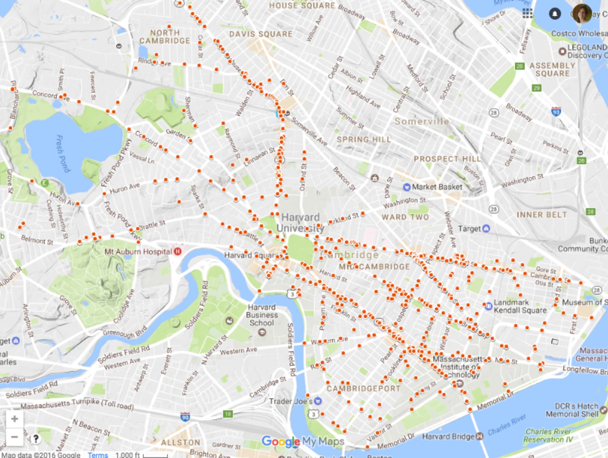
At this point, it’s time to look at bicycle accidents only. Here, I got a hold of a larger data set (accidents from January 1, 2010 – June 30, 2016). I like having more data. This map (below) shows only bicycle accidents, but is still quite jumbled using the standard-sized dots (after all, there are 881 data point here, alas).
The visualization I was most happy with is below. It’s bicycle accidents only and I shrunk the size of the dots down significantly.
The graph above isn’t perfect, but it gives me a lot of information. For one, after making this map I stopped biking on Mass Ave. Period. I’d also avoid Broadway and Cambridge Streets. For my route from my son’s school (in Fresh Pond) to work (in Central Square) I’ve adopted a path similar to the one Cambridge recommends. I’ve read up on bicycling rules of the road and try to wear reflective gear during the day and always use lights at night (the brighter the better). I also stay on sidewalks (where permitted and appropriate) and bike paths.
Please cycle safe.